Redefining Wholesale Marketing with Creativity
Country
Turkey
Industry
Wholesale Marketing
Year
2021
Services Provided
Logo Design
Visual and Corporate Identity
Brand Guidelines
Packaging and Product Design
Stationery and Collateral Design
Tamtacir, a Turkey-based wholesale marketing company, approached us to redefine its corporate identity and strengthen its presence in global markets. This project aimed to establish a cohesive brand image that reflects professionalism and reliability in the international trade industry.
Logo Design: A Fusion of Tradition and Modernity
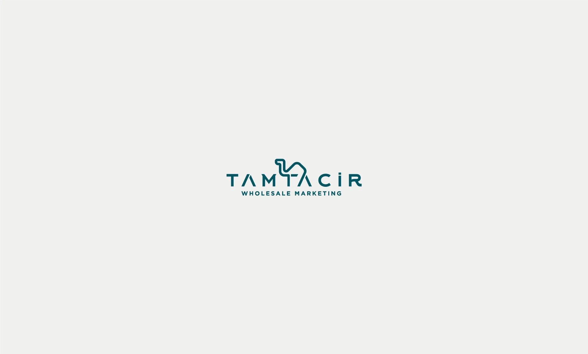
he Tamtacir logo is more than a visual mark; it is a reflection of the brand's core values, mission, and identity. Designed to resonate with Tamtacir’s role in wholesale marketing, the logo merges a minimalist camel figure with clean, modern typography. The camel—a universal symbol of resilience, reliability, and trade—was carefully incorporated into the typography, creating a seamless blend of form and function. This integration not only makes the logo visually unique but also ensures that it communicates trustworthiness and professionalism at first glance.
Color Palette: A Modern Take on Heritage
The logo’s color palette was chosen to reflect Tamtacir’s industry while maintaining a modern and approachable feel.
Teal: Symbolizes trust, growth, and a connection to global trade.
Yellow: Represents energy, optimism, and the dynamic nature of wholesale marketing.
These colors, used cohesively across all branding materials, establish a visual consistency that strengthens the brand's identity and leaves a lasting impression.
Typography: Sophistication Meets Functionality
The font selection was equally deliberate. A clean and modern sans-serif typeface was chosen for its readability and adaptability across digital and physical mediums. The smooth curves and balanced proportions of the letters complement the camel figure, ensuring the logo is both professional and approachable.
Versatility in Application
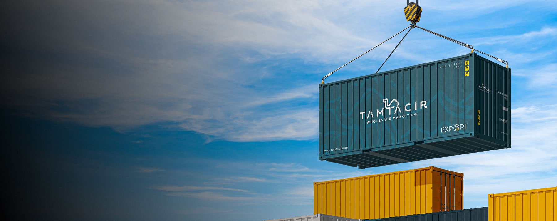
The logo was designed with versatility in mind, adapting effortlessly to various touchpoints. Whether applied to shipping containers, packaging, or stationery, it maintains its impact and clarity. The logo’s ability to stand out in diverse contexts highlights its functionality and thoughtful design.
By combining a timeless symbol with modern design principles, we’ve created a logo that captures the essence of Tamtacir: a brand that bridges tradition and innovation, reliability and creativity.
Versatility in Application: Adapting to Every Platform
Corporate Stationery
We adopted a modern and functional approach to corporate stationery design, including business cards, letterheads, and promotional materials. These elements ensured a consistent brand presence across all touchpoints.
Packaging Design: We designed eye-catching and functional packaging for Tamtacir’s trade boxes, reflecting the company’s professionalism and expertise in logistics.
Vehicle Branding: To enhance the brand's visibility in the field, we developed impactful vehicle wrap designs for Tamtacir’s fleet.
Container Design: We created striking visuals for the brand's shipping containers, reinforcing its strong image in maritime trade.
The Result
The brand identity we created for Tamtacir has successfully elevated its credibility and professionalism in the international trade sector. The integration of the camel into the logo design stands out as a creative triumph, combining the brand's heritage with a modern aesthetic. Our designs increased Tamtacir’s visibility in both local and global markets, creating a strong and cohesive visual identity that resonates with its target audience.


